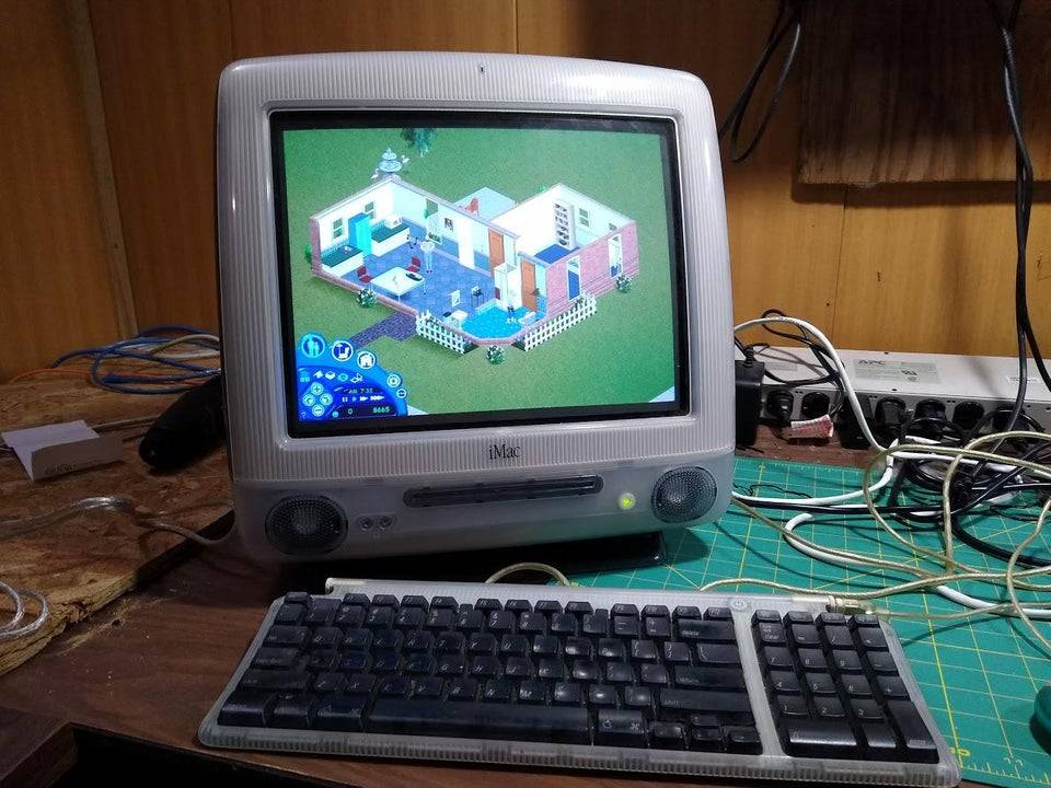
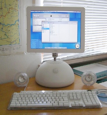
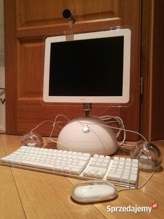
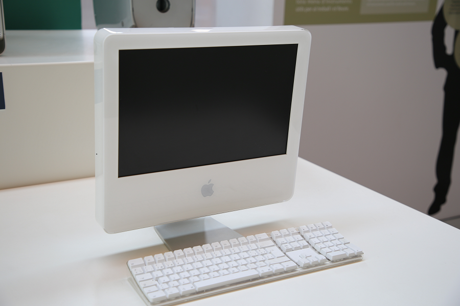
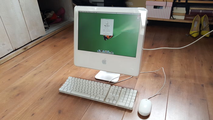
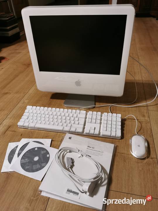
Powyższa galeria to skutek wieczoru spędzonego na nauce CSS Grid. Ogólnie, mimo że przez większość czasu rzeczy euzebiuszowe koduję z ChatemGPT, to chcę też nauczyć się trochę rzeczy robić sam, stąd nauka CSS-a.
The gallery above is the result of one evening spent on studying CSS Grid. In general, even though most of Euzebiusz stuff comes to life through vibe-coding with ChatGTP, I want to learn to do some things myself, hence a CSS study.
    :root {
        --page-background: #431d05;
        --text: #f36888;
        --buttons: #a74314;
        --header-background: #cd96c5;
    }

    body {
        background: var(--page-background);
        color: var(--text);
        font-size: 1.5em;
        font-family: Alata;
    }

    .header {
        margin: 20px 100px 0 100px;
        padding: 50px;
        text-align: center;
        font-size: 2em;
        border-radius: 10px;
        border: 1px solid var(--buttons);
    }

    .container {
        margin: 70px 100px 0 100px;
        display: grid;
        grid-template-columns: 1fr 1fr 1fr;
        grid-template-rows: 1fr 1fr 1fr;
        gap: 10px;
    }

    .item {
        padding: 1em;
        background-color: var(--buttons);
        display: flex;
        border-radius: 10px;
        justify-content: center;
    }

    .item img {
        max-width: 100%;
        height: 250px;
        display: block;
        object-fit: cover;
    }

    .explanation-container {
        margin: 70px 100px 0 100px;
        display: grid;
        grid-template-columns: 1fr 1fr;
        gap: 10px;
    }

    .explanation-item {
        padding: 30px;
        border: 1px solid var(--buttons);
        display: flex;
        border-radius: 10px;
        justify-content: center;
    }

    .code {
        margin: 70px 100px 0 100px;
        padding: 50px;
        border-radius: 10px;
        font-family: monospace;
        border: 1px solid var(--buttons);
        margin-bottom: 100px;
    }
Ażeby na szybko osiągnąć minimalną responsywność zastosowałem: meta name="viewport" content="width=device-width, initial-scale=0.3", ale mam świadomość bardzo hackowatej natury tego rozwiązania. :)
To quickly achieve a minimum level of responsiveness, I used: meta name="viewport" content="width=device-width, initial-scale=0.3", though I’m well aware of the very hacky nature of this solution. :)